-
Welcome to BradleyFans.com! Visitors are welcome, but we encourage you to sign up and register as a member. It's free and takes only a few seconds. Just click on the link to Register at the top right of the page, and follow instructions. If you have any problems or questions, click on the link at the bottom right of the page to Contact Us.
2011-2012 BU uniforms
- Thread starter Da Coach
- Start date


LittleBrave
Active member
I like the white collar trim - I think we had those in the Rob Dye/Roberson era if I'm not mistaken. I like the look from the back - not too fond of the shadow around the #'s either. Looking f/w to seeing the whole uni.
Bobby Parker
New member
The unis are actually pretty cool, literally. They are extremely light and the material almost feels like a paper. Although much looser fitting (thank goodness), they actually remind me of the material my competition swim suits were made of back in the day. They also have holes along the sides of the shorts and are close to mesh on the back, as you can probably see from Jalen's picture.
Buesch N Chips
New member
How often does the team get new uniforms?
Bobby Parker
New member
Usually every other year, or maybe every third year. Has as much to do with Nike marketing efforts as anything.
")
LittleBrave
Active member
We have a look at the fronts of this year's new uniforms. I like them. Thye pants look a little baggier, but I guess that's the style.-
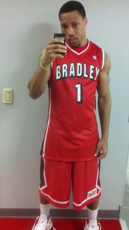
I like the look personally - the shorts' design look cooler to me, the "BRADLEY" across the front of the jersey appears bigger, and just a better look IMO, especially with the white trim.
The block style numbers I wish they'd change, but that's my only gripe.
Future Walk-On
New member
I think we need an alternate that says "Braves" on the front...
With the lettering had what looked like a stitched border rather than blocked
With the lettering had what looked like a stitched border rather than blocked
Braves4Life
New member
I sure hope the shorts look better in person than they do in this picture. They just seem real "sloppy" to me (for lack of a better word).
I sure hope the shorts look better in person than they do in this picture. They just seem real "sloppy" to me (for lack of a better word).
I see what you're saying, but they look the same as last year (see the pic of Warren above).
I sure hope the shorts look better in person than they do in this picture. They just seem real "sloppy" to me (for lack of a better word).
I think maybe the designer saw the pants on your ball handling Brave (from your icon) and tried to emulate them.
LittleBrave
Active member
At what point will the shorts become pants? I'm not saying I want something like John Stockton used to wear, but somewhere in the middle seems logical.
Guys - I think this is just the way DSE is wearing his shorts here - I'm pretty sure they are riding below his waist here. And the angle of the camera makes it appear as though they're longer. True - they are long, but I don't think they'll be much different in length than last year's.
And these unis in black would look pretty sweet IMO - but I wouldn't stray from the red unis too much - maybe a couple times for the season and that's it.